Spring Home Color Guide: Fresh Palettes for Every Room

Spring is the season of renewal, and what better way to celebrate than by refreshing your home’s color palette? Whether you’re tackling a full repaint or simply swapping out accessories, choosing the right hues can transform any space into a bright, inviting retreat. In this guide, we’ll explore four spring-ready color schemes—soft pastels, nature-inspired greens, energizing brights, and grounded neutrals—along with practical tips for mixing and matching in every room.
Soft Pastels: Light & Airy Foundations
Palette: Blush pink, mint green, pale lavender, and sky blue
Why It Works: Pastels evoke the delicate blooms of spring gardens. Their low saturation creates a serene backdrop, making rooms feel open and airy.
Living Room: Paint an accent wall in blush pink and layer in mint-green throw pillows. Balance with a neutral sofa.
Bedroom: Use pale lavender bedding paired with sky-blue curtains. Keep furniture white or light wood to maintain a dreamy atmosphere.
Accessories: Add pastel-hued vases, rugs, or artwork. A few well-placed pastel pieces go a long way.
Nature-Inspired Greens: Bringing the Outdoors In
Palette: Sage, moss, fern, and olive
Why It Works: Greens connect your interior to spring’s lush landscapes. They soothe the eyes and promote a sense of calm.
Kitchen: Paint lower cabinets sage green and upper cabinets off-white. Accent with olive bar stools or fern-patterned textiles.
Dining Area: A moss-green table runner paired with matching napkins brings continuity. Use natural wood chairs for contrast.
Living Spaces: Incorporate houseplants—large ferns or snake plants—in terracotta or stone pots to reinforce the green theme.
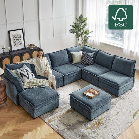
Energizing Brights: Pops of Cheerful Color
Palette: Sunny yellow, coral, turquoise, and chartreuse
Why It Works: Brights inject energy and optimism. Used sparingly, they create focal points without overwhelming.
Entryway: Paint your front door sunny yellow. Add a coral bench or turquoise umbrella stand to greet guests with vibrancy.
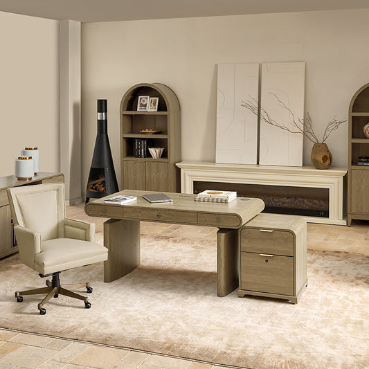
Home Office: A chartreuse desk chair can boost creativity. Complement with a coral desk lamp or bright artwork.
Textiles: Swap throw pillows or curtains in bright hues. A turquoise rug under a neutral coffee table revitalizes the living room instantly.
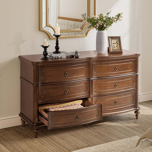
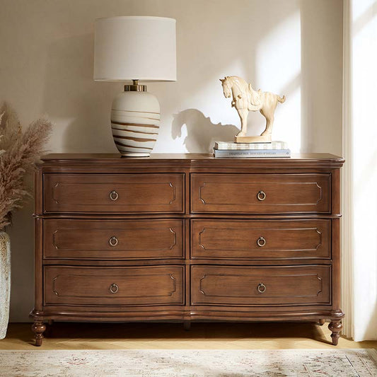
Grounded Neutrals: Warmth with a Modern Twist
Palette: Warm beige, taupe, greige, and soft terracotta
Why It Works: Neutrals anchor a space and let accent colors shine. A warm neutral palette feels cozy and contemporary.
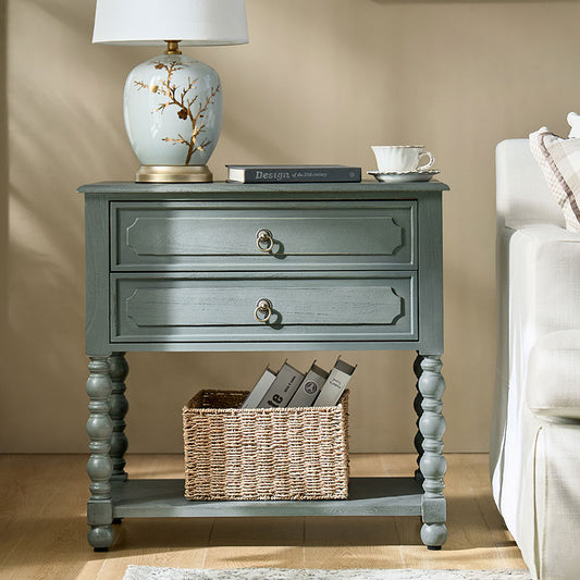
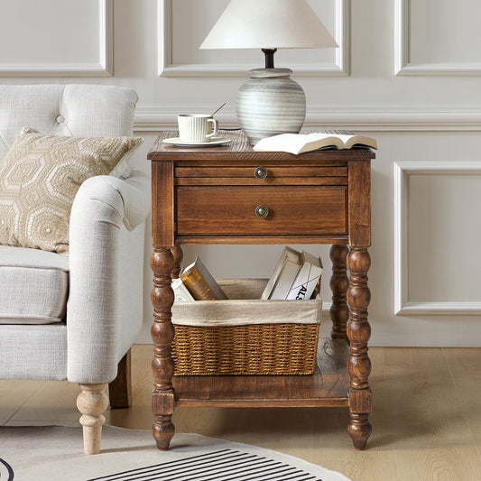
Living Room: Paint walls greige (gray-beige). Add terracotta throw blankets and taupe accent pillows. A beige sectional ties it all together.
Bedroom: Use warm beige for walls and headboards. Incorporate soft terracotta cushions and a taupe rug for layered texture.
Bathrooms: Choose greige tiles and add wooden or terracotta accessories for a spa-like feel.
Tips for Mixing & Matching
Balance Saturation: Pair a bold accent color with a subdued background hue to avoid visual overload.
Use the 60-30-10 Rule: 60% dominant color (walls/floor), 30% secondary (furniture), 10% accent (decor).
Texture Matters: Different materials—linen, velvet, jute—add depth even within a limited palette.
Test Before You Commit: Use sample pots or swatches in different lighting to ensure colors look as expected.
Layer in Greenery: Plants complement any palette, adding life and an organic touch.
Bringing It All Together
Updating your home’s color palette for spring doesn’t have to be a daunting task. Whether you choose soft pastels, nature-inspired greens, energizing brights, or grounded neutrals, the key is to maintain balance and harmony. Start small with accessories or an accent wall, then build confidence as you see your space come alive. With thoughtful color choices and a few well-placed accents, your home will reflect the freshness and vitality of spring all season long.
Ready to refresh your space? Explore more spring décor ideas and shop seasonal accents on our blog. Let the colors of spring inspire your next home makeover!


No comments